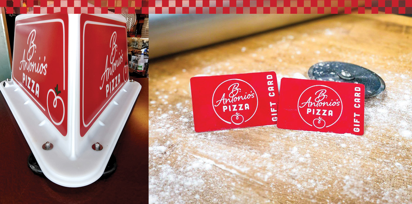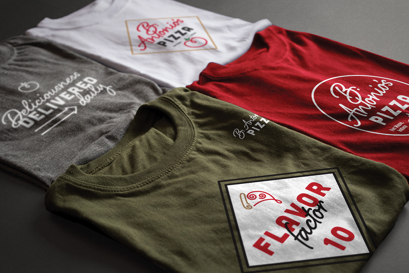


Fresh & Tasty Branding
After 11 years of serving the Fort Wayne, Indiana area delicious, authentic pizza, this family owned restaurant was in need of a new logo and branding that matched their commitment to quality and service. I collaborated closely with the the "B" in B. Antonio's in order to explore a variety of new logos.
CLIENT
B. Antonio's Pizza
ROLE
Creative Direction
Designer
Branding
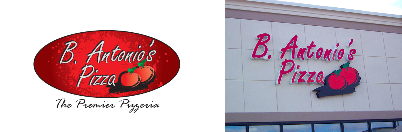
Previous Branding
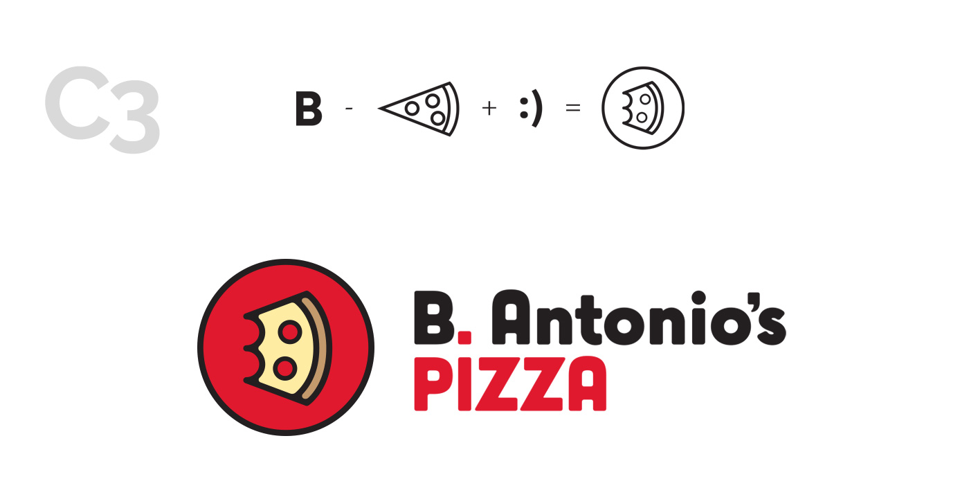
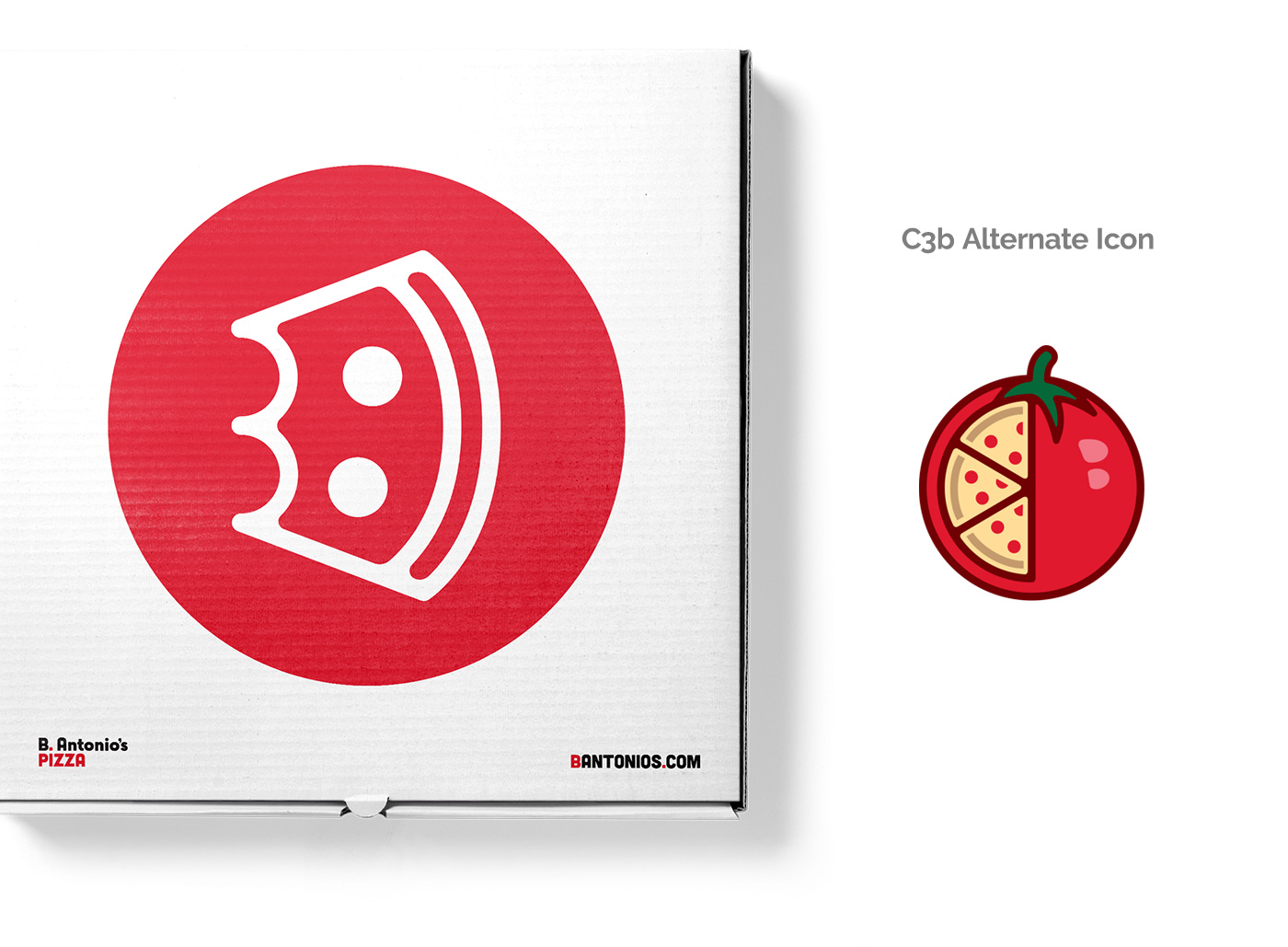
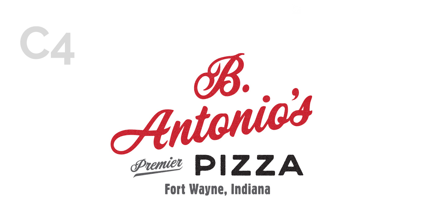
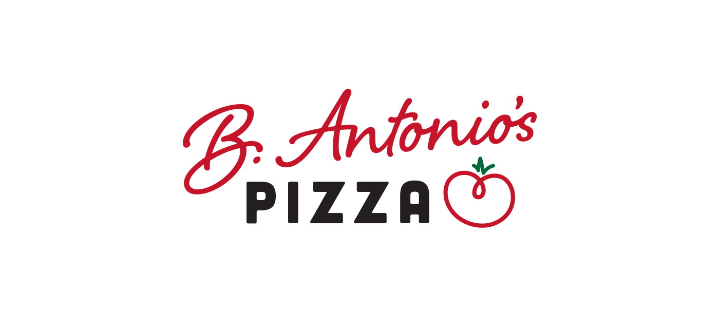
Logo Concept Exploration
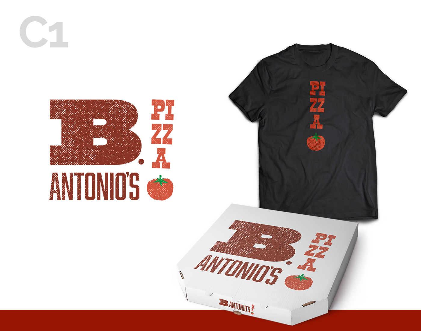
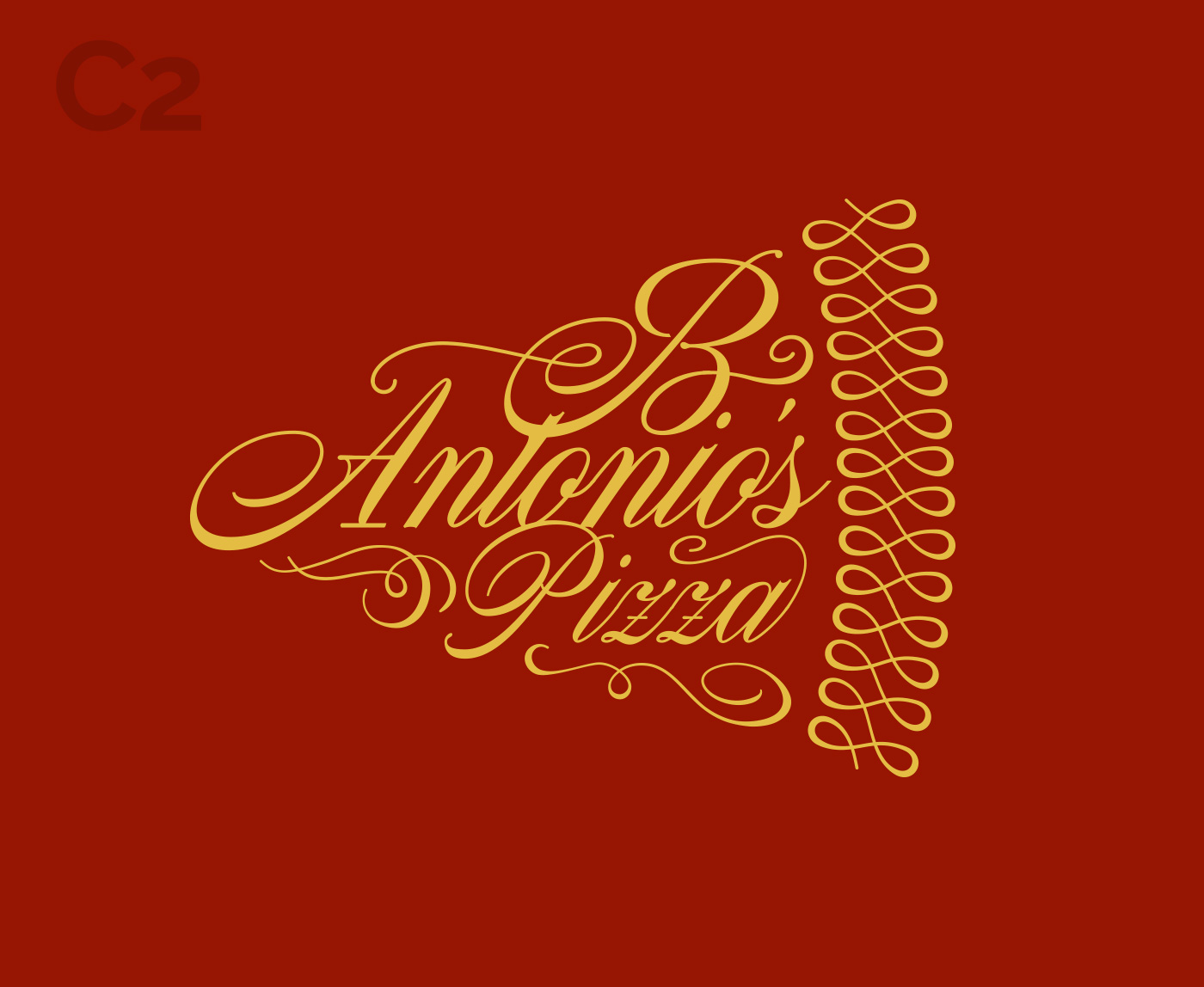
After researching the local competition and catching up on the latest trends in the pizza industry, I created a variety of options for their new branding. I reimagined their core logo elements as letterpress blocks and explored a classical script font paired with some tasty filigree. From there I offered a modern, clean and emoji-esque icon as well as a typography based concept designed to look like the family friendly neighborhood Italian place they are.

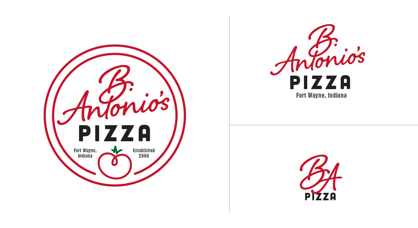
Chosen Concept
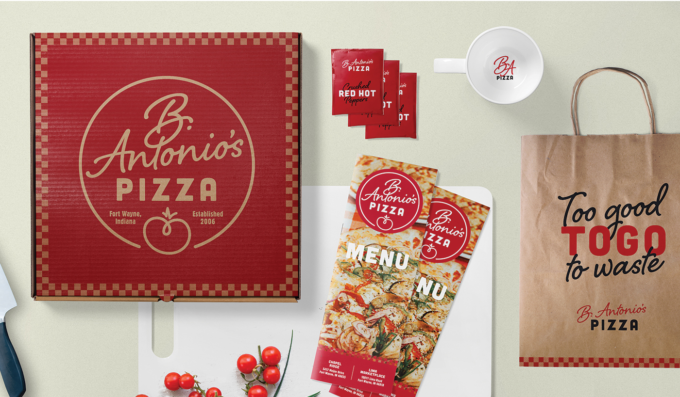
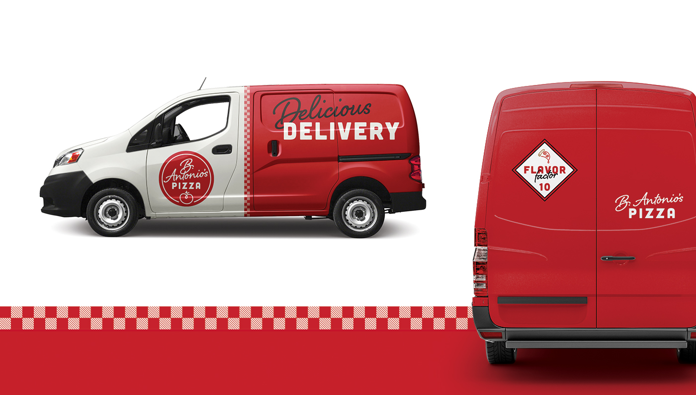
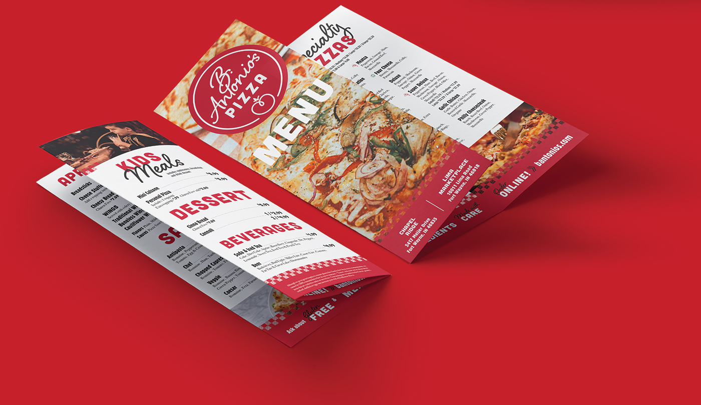
I had some fun with these concepts and made it a difficult decision for the B. Antonio's team. They loved the range and could really see each option working for their business. After a couple rounds of revisions and additional exploration, the team decided they wanted to leverage the brand recognition they've already established. Together we crafted a new logo that not only pulled their favorite design elements from above, but also improved upon the core elements they built their brand around.
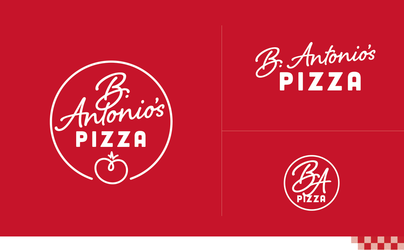
Color Palette

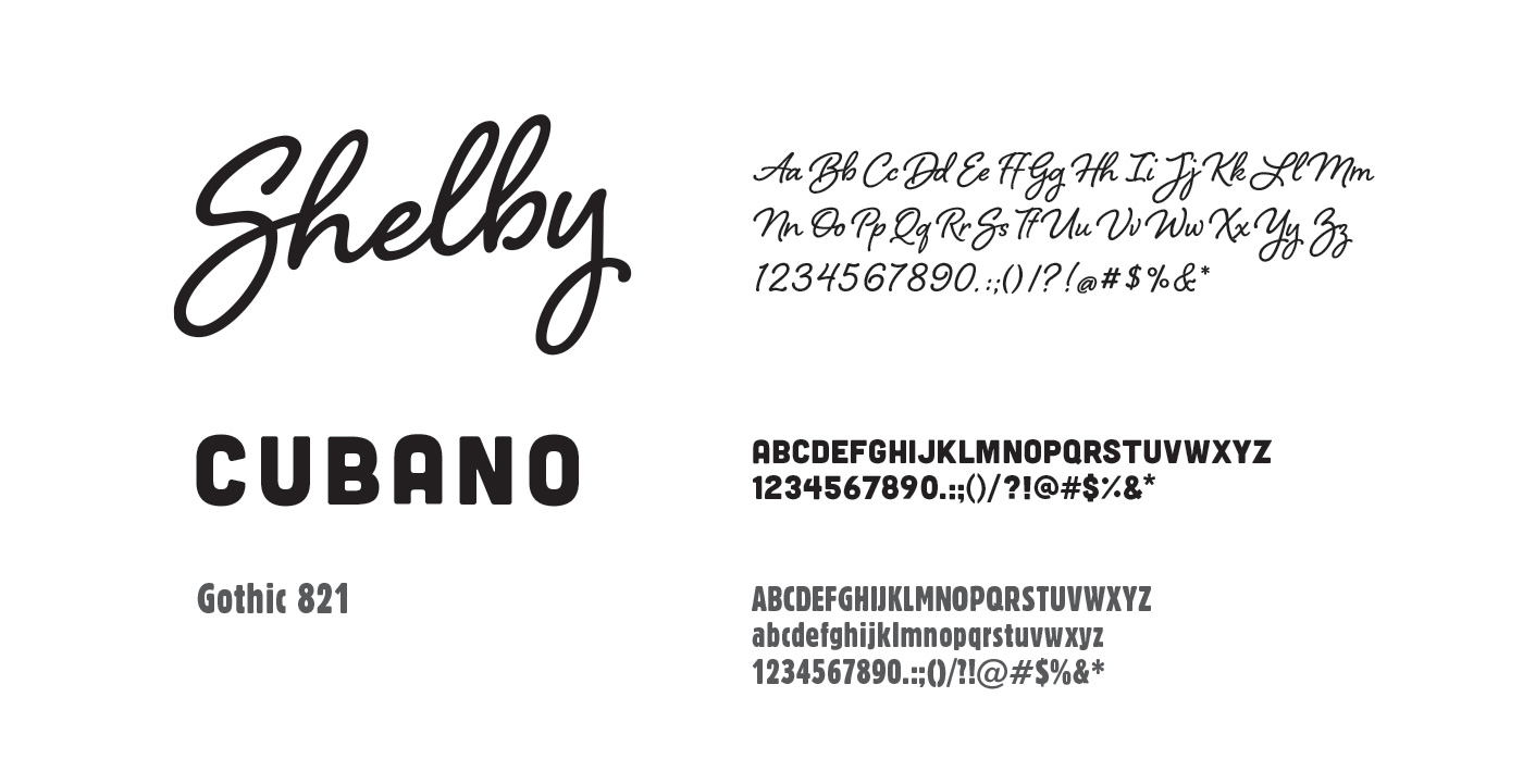
Typography
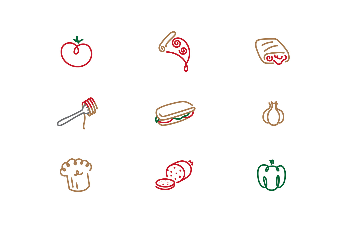
Iconography